- Oct 26, 2015
- By Andrew Rogers
- In Website Design and SEO
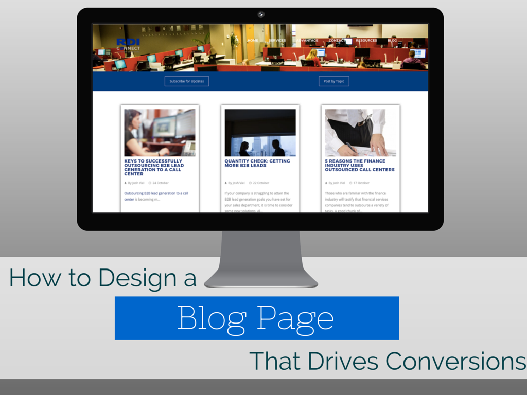
How to Design an Awesome Blog Page that Drives Conversions


Think about the last time you went through a website redesign project — the redesign process can be painful. Most traditional website redesign processes can take 3 months or even longer. During that time, you work hard on getting your team and the website design team to work together. We have heard horror stories of failed website projects that drag on for months after the deadline — or even years!
One of the most overlooked areas of a website is often the blog. I believe this is because it’s ever-changing — the blog pages aren’t like the about page which stays static for long periods of time. Every week new posts are being added with fresh content, so the blog is often thought to be too complicated to make major changes to. Don’t make the mistake of turning a blind eye to your blog pages! I’ll share with you the areas that, when optimized properly, can drive more conversions.
What are the necessary pieces of a blog website page?
Branding
Let’s start with the basics of design...the look. When you look at a blog it should be easy on the eyes and intuitive. Your brand should be portrayed on the blog page by having the same header and footer that your main website has. When you host your website on HubSpot it’s stupid-easy to get your header and footer to match the main site’s header and footer. That’s good news as it will save you time and money.
Fancy Blog Title
When the blog page loads, the most noticeable piece should be the title of the blog. Having a clear, easy-to-read title will let the user know that they have reached the correct page. Here is an example of a “fancy” blog title:
This blog title lets the user know who’s the owner of the blog and what the content is all about. Having this type of title is very helpful for companies that have multiple blogs.
Featured Images
Getting higher conversions from blog posts is going to require adding unique imagery to every blog. We all love stock photos because they are perfectly staged and we can often repurpose them many times. At Cleriti, we like to take these stock photos to the next level and make them unique by using Canva. Canva is a simple cloud-based graphic design software. Here is an example of how we use Canva to make our blog posts stand out and yield higher conversions.
Blog Landing Page Elements
Once a post is published, hopefully we have paired a compelling blog title with an intriguing featured image that successfully convinces users to click through to see the full content. When they get to the post’s landing page, there are some specific elements that should be present to drive conversions:
- Here are the basic elements: Blog title should match the link they clicked to access the full version, published date should be easily located.
- The user should see the same featured image that they saw on the blog listing page. By having this featured image on both the listing page and the blog page, it assures the user that they are in the correct location.
- Social sharing buttons should be accessible and easy to use. Users are more apt to share your post if you make it easy to do so. If you’re writing great articles, users will want to share it with their friends, colleagues, and family.
- Include a blog author bio block to give the content a personal feel.
- Make sure you have a comments section. A really good blog post should inspire users to leave their comments, cultivating a conversation between the user and the blog author.
- One of the most important pieces to include is a call-to-action. Your call-to-action should be related to the blog post content. Utilizing a relevant call-to-action will get you higher conversions because you’re providing additional answers to your users’ pain points.
- Another important element is the “Email Subscribe” form. This allows users to get notified of your latest blog posts via email and helps you build a solid reader audience.
What might your page be missing that would improve its success?
Say you have all the above elements and you still aren’t getting satisfactory conversion rates. Perhaps you don’t have a good understanding of how users are engaging with your blog, or perhaps they are clicking areas that shouldn’t be linked. How would you know what they are doing? You could use a tool like Hotjar to see how users interact with your blog. It’s very easy to get set up. All you need to do is install a tracking code and you’ll be able to get loads of insight. By the way...it’s free! Hotjar does offer premium paid packages, but the free version will start giving you visual analytics right away.
Including all the elements I’ve laid out here and taking advantage of tools like Hotjar and Canva are great options for you to utilize to optimize your blog page. What’s really important is that you aren’t satisfied with just getting results, but push to get even more by making sure your blog page is as up-to-date and optimized as it can be. How could you improve this integral part of your website?


