
- Feb 23, 2015
- By Andrew Rogers
- In Website Design and SEO

All marketers love analytics. We use data, and the analytics that provide insight to that data, to answer 99% of our problems. We can spend hours upon hours obsessing over pageviews, clickthrus, bounce rate, and so on. But how do these numbers translate to the way actual humans view your website? What is it about certain designs that makes people more likely to click?
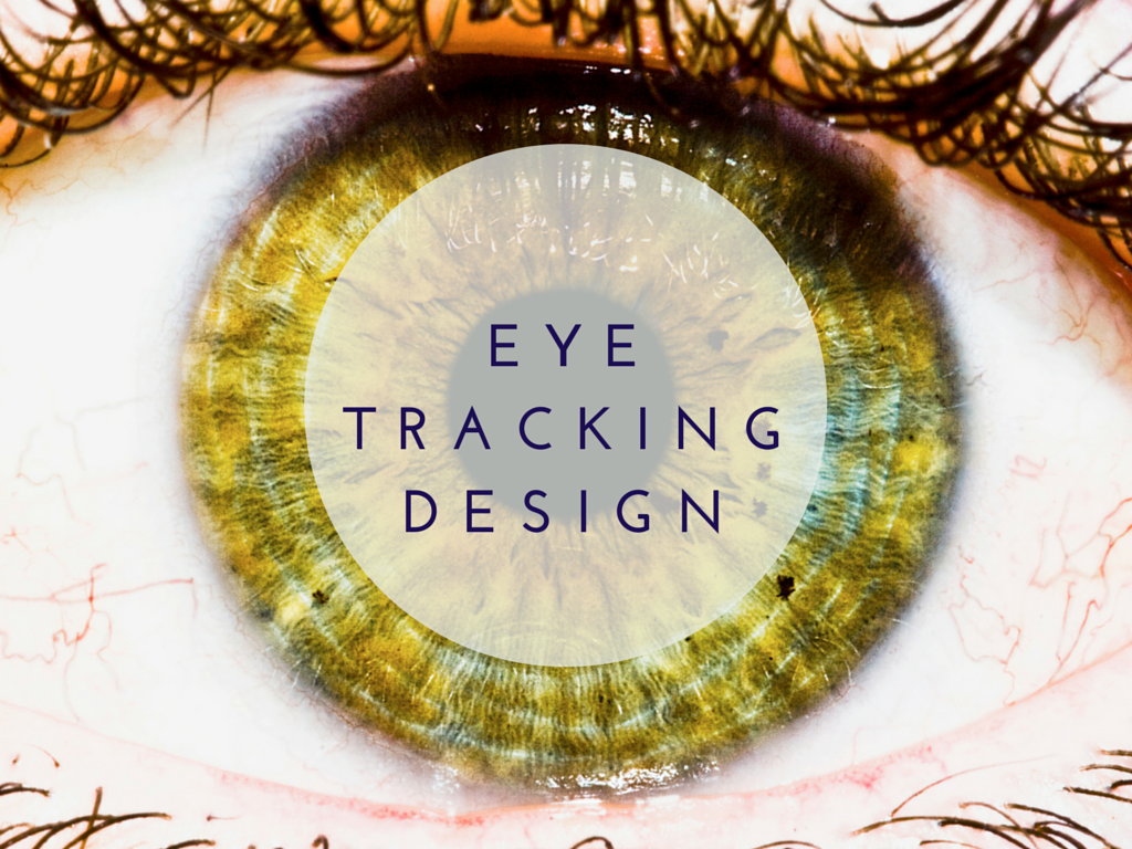
What is “Eye Tracking” and How Can It Help You With Web Design?
To truly understand these questions, we have to understand eye tracking studies. Using programs that can monitor a website user’s eye movements, mouse location, and scrolling position, researchers build what is call a “heat map.” Here is an example:

By looking at some eye tracking case studies, you can enhance your website’s user experience — understanding heat maps will tell you where to place important information, how to organize your site, and more.
1. The Fold
In 2010, the Nielsen Norman Group released a study that examined extensive eye tracking above the fold. They found that web users spend 80% of their time looking at information above the page fold. During the study, over 57,000 fixations—instances when a user looks at something on the screen—were compiled using 21 users who viewed 541 websites.

According to the results, the content at the top of the page gets the most viewing time, and any info you have above the fold can be strategic for your site. If you have key information under the fold, consider changing your layout.
2. Font Size
One of the most important elements to a website is the copy. Good copy leads to good marketing results, and website text can be styled in many numerous ways. In a recent eye tracking study, Steve Outing found that users tend to scan larger fonts and focus longer on smaller text areas. Visitors often “scan” website pagers rather than reading every word; in fact, you may be scanning this article right now! Based on this study, it’s important to have headlines that describe what the section is about—but that are vague enough to encourage readers to learn more.
3. The F Shape
This next study by Nielsen Norman Group is extremely important for designers and copywriters. Utilizing eye tracking software, researchers found that users read webpages in an F-shape pattern:

The red areas indicated the highest concentration of views. On the 232 subjects in the study, most of the users displayed an F shape pattern when viewing the screen.
When designing your next site or content keep the F shape rule in mind:
- Users won't read your text thoroughly in a word-by-word manner.
- The first two paragraphs must state the most important information.
- Start subheads, paragraphs, and bullet points with information-carrying words that users will notice when scanning down the left side of your content.
4. Fitts’s Law
If you’re an analytics nut, then rejoice! In 1954, Paul Fitts discovered a law that predicts that the time required to rapidly move to a target area is a function of the ratio between the distance to the target and the width of the target.
How does that help you? Well, check out this case study by TechWyse.

On this landing page, we can see how Fitts’s Law holds true. One of the fundamental lessons of Fitts’s law is that object “weight” (in the visual hierarchy) determines what attracts eyes— and mouse clicks. By changing the “weight” of several elements on the page, researchers were able to achieve higher conversion rates. When building your site, make sure that the items with the highest importance has the most visual weight on the page.
5. A Lesson From Google - Search Results
In 2011, Dr. Peter J. Meyers performed eye tracking studies on a simple website: Google.com. In the study, Meyers found that the “F shape” theory held true — and, unsurprisingly, he also found that images, maps, and video thumbnails received the most visual attention.

6. Visual Leading
We would all agree that images are extremely important for any website, and many of us have used stock images in our web designs. So, it’s unsurprising to learn that the right stock photo can have a huge impact landing page conversions because we are psychologically reassured when we see human faces.
Kissmetrics confirmed this principle by putting an image of a baby on a landing page. They ran different tests — with the baby looking at the user and the baby looking in the direction of the content on the page — and found that the baby looking at the content was best. The image’s visual direction toward the text was important. Keep this study in mind next time you’re using stock photos on your next design.

7. Location, Location, Location
I’m sure you know the age-old real estate rule: location, location, location. The rule holds true for houses and websites. Check out this study that shows a 304% conversion increase by moving the call to action to the bottom of the page.

8. Inbox Importance
All too often, marketers forget about the importance of email design — think about it, how many emails do you ignore on a day-to-day basis? The Nielsen Norman Group also performed an email eye tracking study and found that people often skip right past an email’s intro to read the headlines and look at the images.
Have a look at how the call to action on the right is ignored in this newsletter:

How to test your site
So you’re all jazzed up now and want an eye tracking study for your own site, right? Well, you may have a couple directions to choose at this point—paid and free. Crazy Egg is the highest rated eye tracking service and offers a free trial. Mouseflow offers a free version with some limitations compared to their paid version.
Another remarkable technique you can try is making the most of A/B testing. Set up a few different landing pages, emails, or calls-to-action to see if you can increase your conversion rates. Keep playing with your designs—and keeping these eye tracking studies in mind—until you find what works best for you. As you test, you may see your conversation rate fall, but remember: you haven’t failed. You’re just learning what does and doesn’t work with your users. If you enjoyed reading this, check out 7 website trends predictions for 2015 here.