- Jun 7, 2017
- By Emily Inman
- In Social Media and Digital Marketing, Content Marketing

We’ve been talking a lot lately about marketing automation — why you need it, how to get the most out of your tools, what not to do. Today, we’re continuing that theme. This blog offers a compilation of best of class automated marketing emails, a selection of marketing emails that hit home with us — both as marketers and consumers.
Take a look at what the Cleriti team thinks makes a good email.
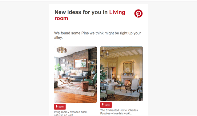
Example 1: Emily’s Pin Suggestions
I am, for better or worse, an inveterate Pinner. I have at least a dozen boards filled with design inspiration for a hundred different rooms in houses I will never own filled with furniture I could never hope to afford. That and a diverse collection of recipes I want to test out.
Pro tip: Pinterest will, in fact, remember your terrible and obsessive quest to find a true blue Panera Sierra Turkey copycat recipe (seriously, though, when did they do away with that sandwich?) and will present you with ALL of the turkey sandwich ideas forever and ever amen.
Emily’s Comments:
- It’s graphic-forward. While it’s generally a given that a graphically rooted medium like Pinterest is going to use images in it’s email automation, I like the way these pins are presented. I’m looking for design inspiration, so I want the images, not editorialization. And the email puts the focus on the pins themselves, cutting off pinner’s tags after a certain character length.
- Personalization: None of these suggestions are random. Every single one is based either on one of my boards or one of my recent searches.
When it comes to marketing automation, a good layout and personalization are critical to success.
Example 2: Jen’s Think With Google Weekly Thought Starter
Content Strategist Jen is a fan of marketers who don’t clutter her inbox with endless asks. As a consumer, she’s looking for straightforward content that adds value to her day. And Google’s Think With Google Weekly Thought Starter fits the bill on both accounts.
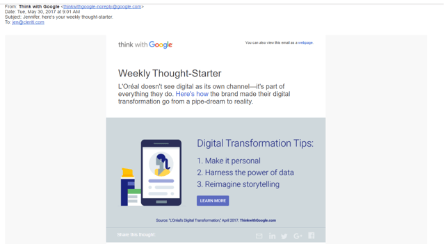
Jen’s Comments:
- The subject line: It's the same every week, but it works for me. I always know what to expect and they always deliver a "thought-starter."
- Clean design. The description is concise. The Image is to the point and highlights the article’s main points.
It works for me because it's informative, clean, concise and doesn't ask me to buy anything.
Example 3: Sarah’s HubSpot Webinar Reminder
While the frequency that HubSpot sends out marketing emails can be a little overbearing at times (sorry, guys, we love you, but it’s true.), the inbound marketing pioneers certainly do know how to craft a good email.
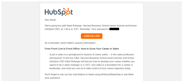
Sarah’s Comments:
Convenience: It had the password and a code so that I don't have to flip through other emails to fish for it. It was everything I needed to sign on and participate.
It was timely. It was sent right when I could have otherwise missed the webinar (both that day and by the hour). The email reminded me of an awesome live event I could have otherwise missed.
If you were to tell me that I would welcome some company emailing me multiple times a day prior to this experience, I would have said you were crazy.
Example 4: Andrew’s Classy Email
As a developer, Andrew is a fan of the cleancut and straightforward. Also dad jokes and so-terrible-they’re-awesome puns. He favors Classy’s automation because, in his own words, “their emails are always classy.”
(This is a long one)
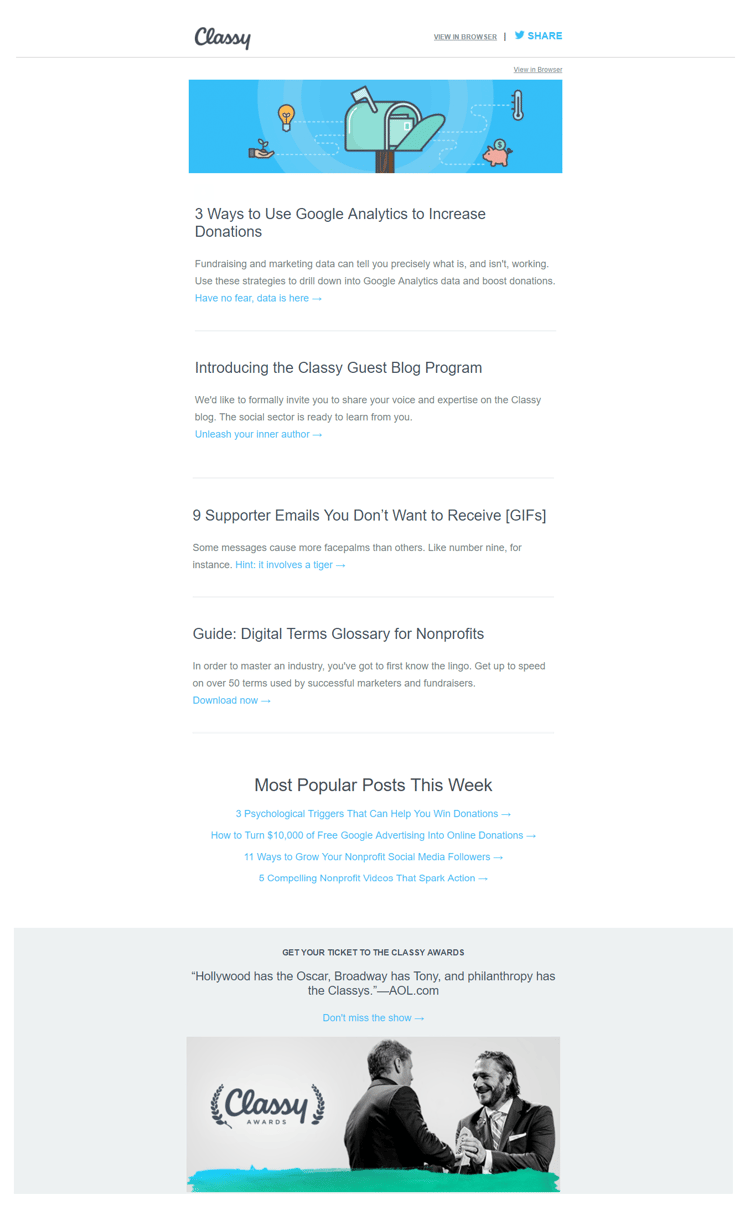
Andrew’s Comments:
- It’s the right amount of eye-catching. The simple animation in the header [which is a gif in the actual email] grabs my attention from the day to day boring promotional emails. It's not too flashy— subtle enough for me to not hate it. The CTA at the bottom is well done, too.
- Design: The font face is modern and attractive. Clear separation between "blocks" of info.
After choosing his example, Andrew did notice that the copyright still says 2016: “Man, that really bugs me. Come on guys, you’re better than that. You’re classy.”
If you’re reading this, guys, update your copyright!