

- May 8, 2015
- By Andrew Rogers
- In Website Design and SEO

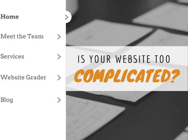
Let's get down to the essentials of what your website needs. What makes it user friendly? What makes it too much or overcomplicated? Overcomplicated websites reduce a positive user experience which can cause users to leave your site. When getting ready for your next website redesign keep these points in mind.
1.Research, research, research.
You can design a site that looks amazing and easy on the eyes but if your persona doesn’t prefer your design preference it can leave a negative connotation in their minds. You can use google analytics to find out where your buyer personas have been and what types of websites they spend the most time on. Check out this awesome article that shows you how to accomplish this type of workflow using google analytics.
2. Functionality
When building websites one party may want to incorporate a module or widget they saw on another website. “This is cool because you can put your zip code in and see the weather report.” While it may be a “cool” function your users may not care at all about it! Always ask yourself “Is this going to educate my user?” If there is no true beneficial result for the user don’t use it.
3. Commonality
How many websites do you view in any given month? According to a 2010 Neilson report, the average internet user visits 89 domains per month. (Source) That’s a lot of different websites. Users get very accustomed to having certain menu items in “standard” areas. For instance home is normally to the left or the logo, about is commonly the second menu item, and contact is normally last. These website “standards” make it easy for website users to navigate your site quickly. Don’t get crazy and put the contact first just to be different. Rearranging the menu in uncommon areas will only frustrate your end user.
4. Keep it Snappy
Speed kills...not just in automobile accidents! “40% of people abandon a website that takes more than 3 seconds to load.” Humans don’t like waiting around for websites to load. Every developer goes to war at some point with designers over this issue. Too many images on a page can cause the pages to come to a screeching hault. Simple websites make for fast websites. Using CSS to generate colors, borders, and drop shadows are much faster than loading an image. Check out these stats regarding page load time.
5. Colors
Choosing the right colors is a big deal. Obviously you want to make sure that the colors you select for your website match your company branding model. This may seem like a simple point but when you start building a website more than one person is involved. A simple website build may have 3-5 developers and designers making changes. Let me give you the basic breakdown of a website build.
1. A wireframe is built for positioning purposes.
2. A design is approved using photoshop.
3. The photoshop file is given to the developers.
4. The developers slice and dice the photoshop file to make it usable for online use.
5. Developers build the site using HTML and CSS.
This is where colors can get messed up. One developer may look at the photoshop file and use their color picker to get the company brand color in HEX code format. Another developer may get the color using RGBA code format. The two colors in the end may be slightly different! It’s important to send a branding guide to every party involved. If you already have a website do a quick visual audit and ask yourself “Do these colors match our branding guide?”.
6. Keep it Simple
Simple websites outperform their complicated counterparts for a simple biological explanation...they're easier to process. Let’s get super nerdy by watching this informative video:
What did we learn? Even the fastest supercomputer on Earth, the human brain, requires processing time. If your website is too complicated it will require the viewer more time to process than a simplified website. I bet Bill Nye the science guy didn’t teach you that!
7. Too Much Text
We all know that humans process images much faster than text. I won’t put down a percentage as this is a highly controversial subject. (Read More about the controversy) It’s absolutely evident that images are easier for the brain to process than text. Pages that have massive amounts of text with no images often times yield a bounce rate. We can utilize google analytics to evaluate page bounce rates but that doesn’t explain why the humans don’t like your page. Why not get some user feedback using the five second test? Check it out here. The five second test helps you understand people’s first impressions of your pages.
So there you have it...our 7-point checklist to find out if your website is too complicated. If you’re getting ready to redesign your website check out this awesome “Website Redesign Strategy” checklist.