- Feb 6, 2013
- By Alicia Bertsche
- In Marketing Strategy and Planning, Website Design and SEO


We're always thinking, discovering and sharing our knowledge of how to connect with customers in the digital age. Here we share some of those thoughts.

 Lately, we’ve been talking with a lot of businesses who are getting ready to undergo a website overhaul. They want to turn their website into an effective lead generation machine, and they’ve realized that their current site just isn’t cutting it. They’ve spoken with design agency after design agency and have a bunch of options on the table, but when I ask them if they’ve had anyone suggest a responsive website design, most of the time I’ve been met with puzzled expressions. So I wanted to take some time to talk about what responsive web design is and why I like it so much.
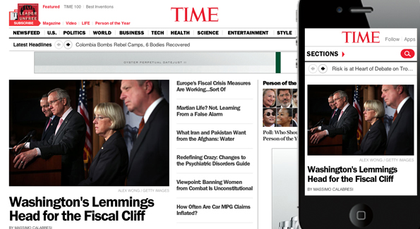
In a nutshell, a responsive website is one that is designed so that its elements are viewable and easy to access no matter what device the user is viewing the website from. It is not a mobile site. In fact, responsive web design renders the need for two different sites - desktop and mobile - void. This is because responsive web sites are “smart” and can recognize what size screen it is being displayed on, and adjust its menu items and other elements accordingly, so that large amounts of scrolling are unnecessary and visitors still see the same content. Confused? Let’s check out an example:

The age of mobile web access is here and is only going to grow. To address this issue, I really encourage businesses to look into responsive web design as a viable option for their own website redesign projects in order to capture the maximum amount of leads from their mobile web visitors.
Have other questions on responsive web design or all other things web? Drop us a comment below!
We know what it takes to create meaningful connections with customers.
Subscribe to our newsletter and start thinking with Cleriti.

