- Feb 16, 2015
- By Andrew Rogers
- In Marketing Strategy and Planning, Website Design and SEO


We're always thinking, discovering and sharing our knowledge of how to connect with customers in the digital age. Here we share some of those thoughts.

We all know how important a well crafted landing page is. The landing page is essential for leading your website visitor through the buying journey. Every marketing and sales team has their eyes trained on the conversion rate of their landing pages. What many marketers forget about is what happens after a landing page conversion.
When building a HubSpot landing page you have two options when a users enters in their precious information. You could utilize the “Show an inline thank you message” option. The problem with using the inline thank you message is that you may be missing an opportunity to lead your user further along the buying journey. The inline message should include a link, or instructions, to provide the offer promised by the call to action. Due to the limited functionality of the inline thank you message I don’t recommend using this method.
There is a much better option for providing your valuable offer to your user. You can redirect the user to another page. Because you are using a site page the sky's the limit! I have 3 elements of the perfect thank you page that I believe give the user a pleasant experience. Let’s have a look at what could be included in your thank you page to help convert that prospect to a customer.
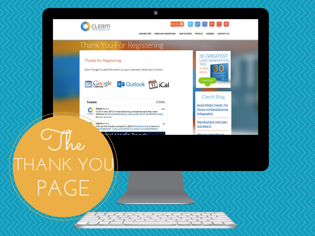
The most important item to have on your thank you page is what was shown on the call to action. If your call to action was “Get Our Manufacturing Outsourcing Whitepaper” you better have a link that gives the user what they were expecting. It would also be a good idea to have an automated follow up email that has the offer included. This should be the largest section on the page. Don’t make it difficult for the user to find what they were looking for.
Notice on the thank you page we another call to action on the right sidebar. You can utilize a smart call to action that changes with the lifecycle of the user. Once they get what they were looking for you can be there to offer another great asset. Utilizing this call to action you will be closer to getting those leads moved over to your marketing qualified list.
The final piece to a rocking thank you page is offering additional content to the user. I like to utilize HubSpots RSS module. Using this module lets me keep this “other content” spot constantly up-to-date. For this example we are displaying the latest blog post from our blog. If you are using the HubSpot COS getting this setup is fairly easy.
First:
Go to the Content > Design Manager and select the page you want to use for your thank you page template. Add a row and swap it out for the RSS Listing module.
Second:
Now you can select the options for the RSS Listing module. For this instance I have decided to only display one blog post. This keeps the page simple and clean but still offers dynamic content while showcasing your valuable resources.
Is it time to look back and touch up your current thank you pages? Send us some of your favorite thank you page examples or feel free to ask for help refreshing yours.
We know what it takes to create meaningful connections with customers.
Subscribe to our newsletter and start thinking with Cleriti.

